Battle scenes
Use the runnable scene foundation created by Initialize System, then replace its background, unit layout, hand, HUD, and presentation for the project
After the selected GameEncounter reaches GameCardManager, the scene objects turn the player, enemies, piles, and phase state into an interactive battlefield. A battle started from a fixed Bootstrap entry or a dynamic project flow uses the same Manager, Battle Runtime, Battle Canvas, and presentation objects.
Initialize the scene foundation
Open an empty scene, enter Game Card System through the following menu, then click Initialize System.
Tools > TinyGiants > GCS > Game Card System
The command creates a scene where you can assign an Encounter and adjust presentation, Battle Board uses one Player Area root with three slots, single-character Encounters use slot 0 and parties map members by Slot Index
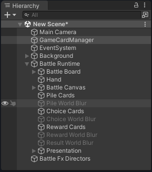
The six root objects above cover battle startup, camera and input, background, unit and card interaction, HUD, and effect feedback. When replacing visuals or integrating a project flow, follow this Hierarchy to the corresponding entry point.
| Root object | Core components | Responsibility in the complete flow |
|---|---|---|
Main Camera | Camera, AudioListener, Physics2DRaycaster | Renders the world-space battlefield and sends pointer events to world-space cards with CardViewInput |
GameCardManager | GameCardManager, GameCardEncounterBootstrap | Registers databases, owns current battle state, and provides a default Encounter entry point in fixed scenes |
EventSystem | EventSystem, StandaloneInputModule | Sends pointer, Submit, Cancel, and button input to cards, the HUD, and temporary views |
Background | SpriteRenderer, BattleBackgroundFit, BattleEncounterBackground | Fills the camera view and applies an Encounter icon or class background in fixed-start scenes |
Battle Runtime | Battlefield, hand, Canvas, and Presentation child objects | Turns the player, enemies, piles, and battle phases into interactive scene content |
Battle Fx Directors | IntentThreatTelegraph | Plays separate visual and audio warnings when a high-threat attack Intent appears |
-
The Manager is found by its
GameCardManagercomponent, but an incompleteBattle Runtimeor another template root with the expected name is not replaced as a whole. -
A functionally equivalent camera or EventSystem with a different name is not detected.
-
Before initializing again, check the root names and internal structure. This prevents incomplete objects from remaining incomplete or duplicate services from appearing in the scene. The Background components, sorting, and class-background configuration are still added or overwritten according to the rules above.
See Second battle for the full process from an empty scene through initialization and Encounter configuration. Once the scene foundation is correct, continue with the camera, input, and background.
Configure the camera, input, and background
GameCardManager turns an Encounter into a runtime battle. Main Camera and EventSystem receive input from world-space cards and Screen Space UI, while Background supplies the battlefield image.
| Object | Template default | Boundary to preserve when changing it |
|---|---|---|
Main Camera | Orthographic Size 5, position (0, 0, -10), full-screen Viewport, HDR and MSAA enabled | You can change composition, Render Texture, or camera stack. If world-space card input remains in use, the Camera responsible for events must keep Physics2DRaycaster |
EventSystem | Navigation events enabled, Drag Threshold 10, input axes Horizontal, Vertical, Submit, and Cancel | You can replace the input module, but keep only one enabled EventSystem in the scene |
Background | Sorting Layer Background, Order -20, Overscan 1.01, Vignette Strength 0.3 | You can replace the entire background system, but the final result must render behind units, cards, and the HUD |
An Encounter passed dynamically to GCSApi.StartBattle does not trigger this background change. The scene coordinator must update the background, or first assign the Encounter to Bootstrap.DefaultEncounter and call Apply on the background component.
The complete Demo adds EncounterParallax above the single-image background for a multilayer animated result. A newly initialized scene provides a clean base image that is easy to replace. See Demo battle scenes for the finished hierarchy and motion.
Understand the Battle Runtime hierarchy
Once startup, input, and background are ready, Battle Runtime expands units, the hand, interfaces, and feedback in the order the player sees and uses them.
🎬 Battle Runtime                                # Root for all battle presentation and interaction
├── ⚔️ Battle Board                              # Creates and places player and enemy unit views
│   ├── 🦸 Player Area                           # Parent that arranges player positions by Slot Index
│   │   ├── 1️⃣ Slot 1                           # World-space anchor for player slot 0
│   │   ├── 2️⃣ Slot 2                           # World-space anchor for player slot 1
│   │   └── 3️⃣ Slot 3                           # World-space anchor for player slot 2
│   ├── 👹 Enemy Area                            # Parent that arranges enemy positions in order
│   │   ├── 1️⃣ Area1                             # Position for the first living enemy
│   │   ├── 2️⃣ Area2                             # Position for the second living enemy
│   │   └── 3️⃣ Area3                             # Position for the third living enemy
│   └── 🎯 Targeting Arrow                       # Visual line from a dragged card to its target
├── 🃏 Hand                                      # Hand layout, pooling, pointer input, and card-play presentation
├── 🖥️ Battle Canvas                             # Root for Screen Space HUD and pop-up views
│   ├── 📊 HUD                                   # Energy, piles, End Turn button, and turn banner
│   ├── 📚 Pile Inspector                        # Paged view of Draw, Discard, and Exhaust piles
│   ├── 🔀 Choice Presenter                      # Displays FlowGraph candidates and confirmation controls
│   ├── 🎁 Reward View                           # Selects card, energy, cost, or Skip rewards
│   ├── 🏆 Result Popup                          # Victory and defeat results panel
│   └── 🎭 Splash Screen                         # Displays encounter information and delays battle startup
├── 🗃️ Pile Cards                                # World-space card container used by Pile Inspector
├── 🌫️ Pile World Blur                          # Dims the battle behind an open pile
├── 🃏 Choice Cards                              # World-space container for choice cards
├── 🌫️ Choice World Blur                        # Dims the battle during a choice
├── 🎁 Reward Cards                              # World-space container for reward cards
├── 🌫️ Reward World Blur                        # Dims the battle while rewards are visible
├── 🌫️ Result World Blur                        # Dims the battle behind the results panel
└── 🎛️ Presentation                              # Shared audio, VFX, text, impact, and cursor feedback
    ├── 🔊 Audio                                 # Music, ambience, gameplay SFX, and Mixer routing
    ├── 💥 VFX                                   # Responds to scene-level and unit-level effect requests
    ├── 💬 Floating Text                         # Damage, healing, status, and custom battle text
    ├── ⏳ Delayed Trigger Indicator             # Coordinates delayed-trigger icons in unit status strips
    ├── 💢 Impact Director                       # Coordinates hit stop and impact feedback
    └── 🖱️ Cursor                                # Applies the battle cursor texture and scale
Configure unit areas and target space
When battle starts, BattleBoard places players in Player Areas by Slot Index and enemies in living-enemy order, additions, removals, deaths, and revivals update their views
Click a living player to select Active Player, targeting highlights only enemies, allies, or other allies allowed by the card
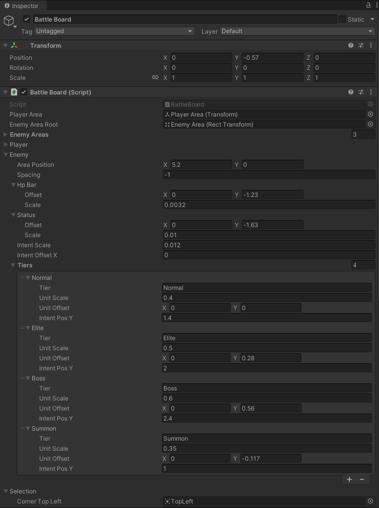
The Inspector shows the player anchor, enemy parent, three default enemy positions, and visual settings for Normal, Elite, Boss, and Summon. Selection colors, health-bar offsets, and death timing outside the screenshot are also controlled by the same BattleBoard.
| Setting | Template value | Effect on the battlefield |
|---|---|---|
Player Area Root | Player Area | Acts as the parent of the player formation |
Player Areas | Slot 1, Slot 2, Slot 3 | Maps the fixed maximum of three player views by Slot Index |
Enemy Area Root | Enemy Area | Acts as the parent of the enemy formation |
Enemy Areas | Area1, Area2, Area3 | Assigned to living enemies in order. Add more positions to display four or more enemies at once |
| Player area position | Expanded vertically around (-5.2, 0) | Keeps up to three members visible for switching and ally selection |
| Enemy area position | (5.2, 0) | Sets the layout anchor for the enemy side |
| Enemy spacing | -1 | Tightens or expands the formation according to the current enemy count |
| Unit scale | Normal 0.4, Elite 0.5, Boss 0.6, Summon 0.35 | Gives each Tier a recognizable visual size |
| Intent Y | Normal 1.4, Elite 2, Boss 2.4, Summon 1 | Places Intent UI above the corresponding body size |
| Death hide delay | 0.9 seconds | Leaves time for the death presentation before hiding the unit view |
BattleOpeningEnemyTooltip on Battle Board anchors the opening enemy description to Enemy Area. The template can run it without a Splash Screen, with a per-character interval of 0.026 seconds. You can replace its Prefab, text, and timing, or disable the component when the project does not need an opening enemy description.
Configure hand interaction
After the unit views and enemy positions exist, HandController connects drawing, hover, dragging, the play area, and target selection. It passes successfully played cards to the exit presentation and returns their views to the pool.
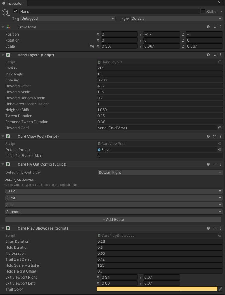
The four visible components above handle hand layout, view pooling, exit routes, and card-play presentation. HandController below them connects input, target selection, and battle state.
| Component | Template default | Responsibility in the interaction flow |
|---|---|---|
HandLayout | Radius 21.2, Max Angle 16, Spacing 3.296, Hover Scale 1.15, Tween 0.15 seconds, Entrance 0.38 seconds | Arranges cards in a fan, makes room for a hovered card, and handles entrance and rearrangement animation |
CardViewPool | Basic card Prefab, Initial Per Bucket Size 4 | Starts each Bucket at 4, creates views on demand, and returns released views to the pool |
CardFlyOutConfig | Default, Basic, and Burst exit to Bottom Right; Skill and Support exit to Bottom Left | Chooses the left or right exit direction for each card type. CardPlayShowcase performs the actual movement |
CardPlayShowcase | Enter 0.28 seconds, hold 0.8 seconds, fly out 0.65 seconds, hold scale 1.25 | Focuses the played card before it exits and tracks presentations that have not finished |
HandController | Draw interval 0.27 seconds, hover grace 0.08 seconds, Target Pick Radius 1.6, lower 32% of screen as play area | Connects pointer input, target selection, Battle Board, the view pool, hand layout, and card-play presentation |
Changing card size affects fan spacing, hover height, adjacent-card switching, and the feel of target dragging together. Recalibrate these values as one set after changing a Prefab. See Card and pile lifecycle for the rules that move cards into and out of these views.
Configure opening presentation for a fixed scene
When Bootstrap.DefaultEncounter is configured and Auto Start On Play is enabled, the template BattleSplashScreen displays Encounter information before starting the battle. It coordinates opening audio, card dealing, the enemy tooltip, and the turn banner. It reads only Bootstrap.DefaultEncounter and cannot display an Encounter passed dynamically through GCSApi.StartBattle. When a map or quest selects the Encounter dynamically, disable, remove, or fully replace the Splash Screen so it does not continue reading and starting the fixed Encounter. See Starting a battle for the fixed and dynamic entry-point boundary.
Configure the persistent HUD
After battle starts, HUD continuously displays current resources and pile state and sends End Turn and pile-view actions back to the runtime.
| Child object | Component | Player-facing function |
|---|---|---|
Energy Display | UnitEnergyDisplay | Displays the party's shared current and maximum energy |
End Turn Button | EndTurnButton, UIButtonSfx | Ends the player turn and plays button feedback |
Draw Pile | DeckCounter | Displays the count and opens the draw pile |
Discard Pile | DiscardCounter | Displays the count and opens the discard pile |
Exhaust Pile | ExhaustCounter | Displays the count and opens the exhaust pile |
Turn Banner | TurnBanner | Presents player and enemy turn changes and holds Animation Gate during its animation |
You can redesign the HUD completely. New buttons and counters must still call the End Turn and pile-query interfaces. Custom UI integration explains how to connect them without the template Prefabs.
Configure temporary views
Pile inspection, FlowGraph Choice, victory rewards, and final results do not stay on screen together. Each view takes input when its matching state arrives and uses the world-space holders and Blur Sprites above to organize world-space cards.
| Trigger timing | Child object and component | Template configuration and runtime boundary |
|---|---|---|
| Player inspects a pile | Pile Inspector, CardPileInspector | Shows 5 × 2 cards per page at scale 0.34 and reuses CardViewPool to browse Draw, Discard, and Exhaust piles |
| FlowGraph enters Choice | Choice Presenter, BattleChoicePresenter | Displays candidates at scale 0.34 and returns Confirm or Skip to FlowGraph. If the scene has no Presenter, Choice enters the Skipped branch directly instead of leaving an empty wait screen |
Victory raises OnBattleRewardOffered | Reward View, CardRewardView | Displays cards at scale 0.4 with two reveal delays of 0.5 seconds. Calls ApplyReward or SkipReward after a card, energy, cost, or Skip selection |
Defeat ends, or victory rewards complete and raise OnBattleEnded | Result Popup, BattleResultPopup | Uses victory and defeat delays of 0.9/1.0 seconds and a typing speed of 42 characters per second |
-
Choice Presentercompletes the user selection awaited by FlowGraph.Reward Viewsubmits the reward result, clearsIsWaitingForReward, and allows the battle to raiseOnBattleEnded. -
A replacement for either view must preserve the corresponding callbacks. A reward view cannot close only its visual object without submitting the reward result.
-
Keep exactly one
IChoicePresenterimplementation in the scene. The Manager searches disabled objects as well, so retaining both the template and custom components makes selection order unreliable. Remove the old component when replacing Choice UI. Disabling its GameObject is not enough.
Configure presentation feedback
Once card play, status changes, and phase transitions work correctly, Presentation turns those results into audio, scene effects, floating text, and impact feedback. Players can understand what happened without relying only on numeric changes.
| Object | Component | Feedback responsibility |
|---|---|---|
Presentation/Audio | BattleAudio | Manages cards, UI, battle, results, music, Mixer routing, volume, and gameplay audio |
Presentation/VFX | BattleVFXPresenter | Responds to battle start, player turn, enemy turn, and battle end events with scene-level Ambient, BattleStart, TurnStart, Victory, and Defeat VFX |
Presentation/Floating Text | BattleFloatingTextPresenter | Displays damage, healing, status, and custom battle text |
Presentation/Delayed Trigger Indicator | UnitDelayedTriggerIndicator | Coordinates one countdown icon per pending trigger inside the existing unit status strips |
Presentation/Impact Director | BattleImpactDirector | Coordinates hit stop and impact feedback |
Presentation/Cursor | BattleCursor | Applies the battle cursor texture, with template scale 2 |
Battle Fx Directors | IntentThreatTelegraph | When any Attack Intent reaches at least 12, plays threat VFX 0.9 units above the enemy and warning audio at volume 0.7 |
UnitDelayedTriggerIndicator coordinates the status strips instead of drawing a separate overhead hourglass badge; each pending trigger receives its own icon using the captured card icon first, then the captured status or source-unit icon, together with its remaining-turn number; the entry uses the strip of a living target that remains in the battle and falls back to the source when that target dies or leaves the battle
Hovering an entry shows its name, description, trigger phase, and remaining turns; concurrent triggers are ordered by remaining turns, phase, then TriggerId, and every delayed-trigger entry is cleared when the battle ends
The FlowGraph Play VFX node instantiates its own configured Prefab directly and does not pass through BattleVFXPresenter. Node effects and scene-phase effects can therefore be replaced independently. See FX nodes for audio, VFX, and floating-text behavior and Flow nodes for wait parameters.
-
Audio, VFX, Floating Text, Delayed Trigger Indicator, Impact Director, Cursor, and Intent Threat Telegraph can be replaced or removed independently. Removing one only removes its feedback and does not change runtime resolution.
-
Splash Screen, Hand, HUD, Choice, and Reward perform startup, interaction, or runtime callbacks. Replacements must still start the correct Encounter and submit card plays, End Turn, Choice selections, and Reward results.
When a phase stops progressing, first identify the awaited object:
-
AnimationGatewaits for presentation release through its Holder count. -
Choice waits for a selection callback through
IsWaitingForChoice. -
Reward waits for reward submission through
IsWaitingForReward. -
CardPlayShowcase.ActiveCountonly makes reward and result views wait until card presentation finishes.